The Lightbringer
OVERVIEW
Jake Stone is an indie author who writes in the harem genre and he really liked the work I have done for other authors. He reached out to me to redesign the title typography for The Lightbringer series, which tells of an experiment gone wrong and a young man thrust across space to a desert planet ruled by human slavers, who trade in the most precious commodity in the galaxy — women.
The client made the covers himself, but felt that they didn't appeal enough to his target audience as sales weren't up to what he'd expected.
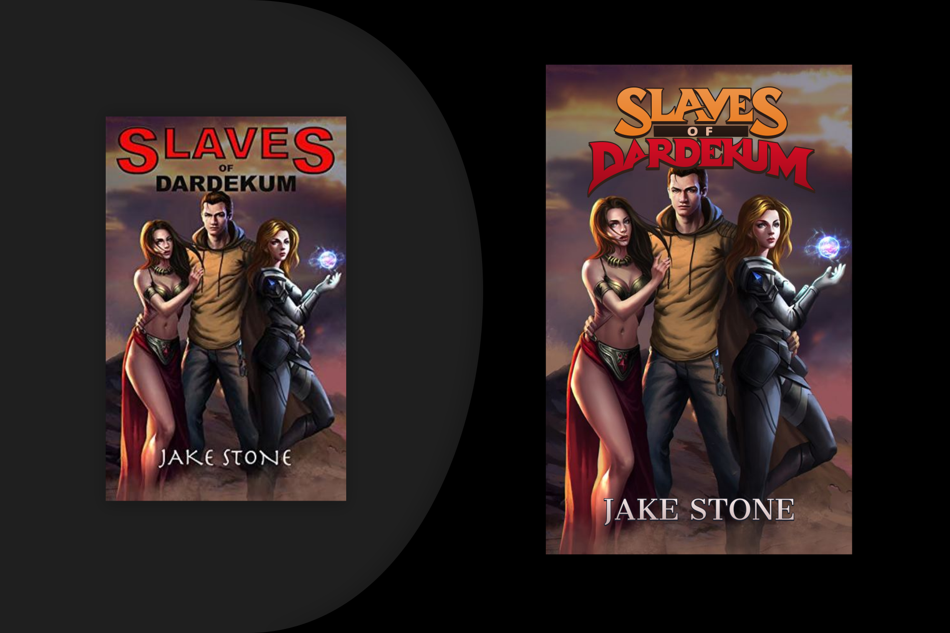
the old and new covers for the first book in the series
CHALLENGES
A lot of readers will decide whether to read a book based on its cover, so the importance of a well-designed cover can't be overstated. For this project, the challenge was to come up with a title typography that not only represents the story, but looks good and matches well with the cover artwork.
LET'S EXPLORE
The story is about a failed experiment that thrusts a young man across the universe into a new and deadly world. I looked through the reviews on Goodreads, and one of the reader's comment about the tone being similar to the Warhammer series resonated with me — so much so that I took inspiration from their titles such as "Eisenhorn" and "Draco" for the initial concept.
The client felt that the concept matched well with the spirit of the book. His only concern was that the lettering wasn't strong enough and conjured the imagery of a pirate flag flailing in the wind to him, which might not work since the story is set in the desert amidst a middle eastern setting.
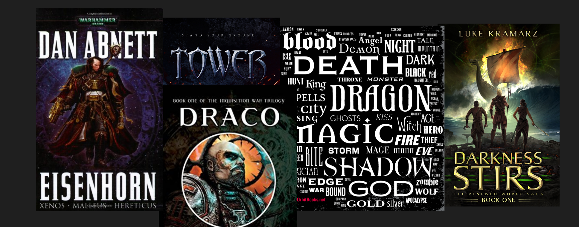
some of my inspiration for this project
THE FINAL
I made the lettering bolder based on his feedback. He loved it and we went forward with the typography. I then added a slight gradient to make the title stand out more. For the author name we chose a font that's simpler to create contrast.
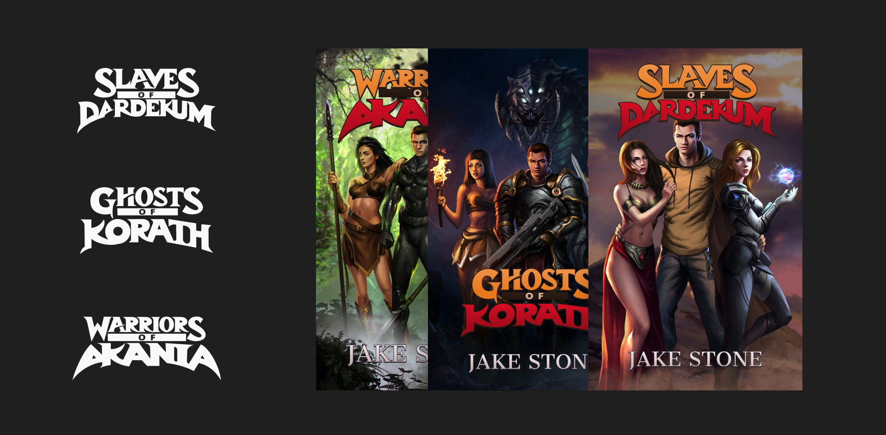
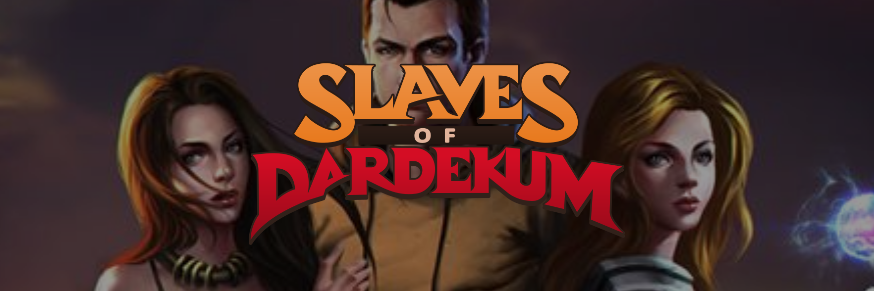
the title typography for the Lightbringer series
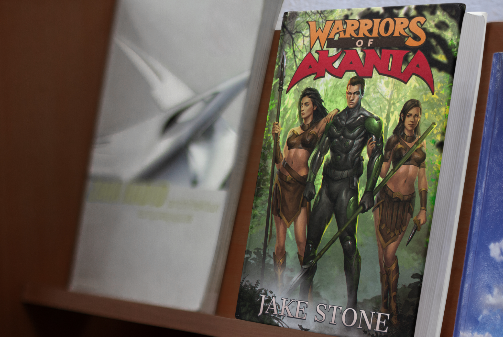
Warriors of Akania on a book shelf
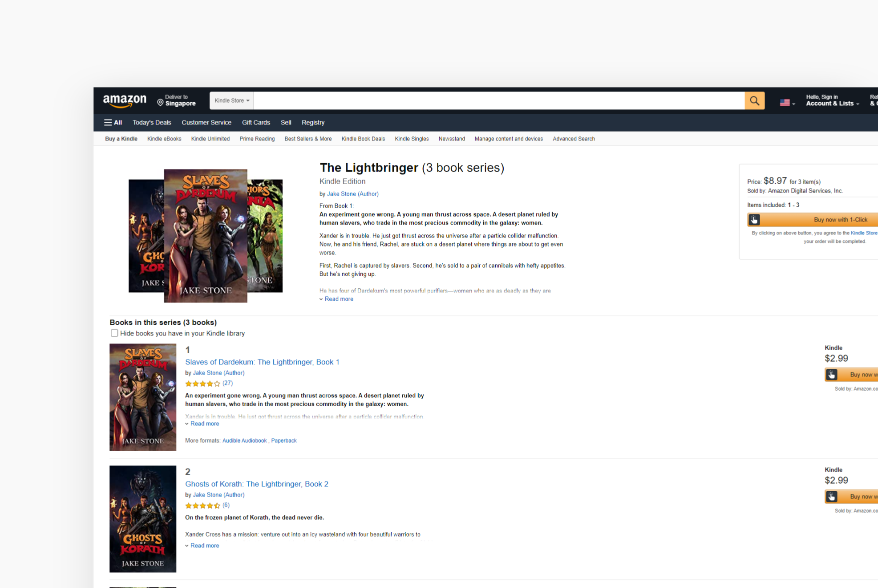
the Lightbringer series on Amazon
