Petrone Technology Group

OVERVIEW
Petrone Technology Group Inc. is South Florida's leading innovative company for all your home and business audio, video, and security needs. They are an owner-operated business made up of trained technicians who offer quality workmanship at affordable rates.
I have been in a partnership with a web developer, and he was the one who introduced this project to me. The client was hesitant about whether to proceed with a redesign of their website, so I was brought in to create a landing page mockup in hopes of changing their minds.
WHAT WAS THE PROBLEM?
Let's take a look at their website. I feel that the design, though responsive and adapts to different screen sizes, looks quite outdated. The color scheme seems a bit inconsistent — on hover the navigation links are a light blue when everything else is primarily bright orange and dark gray.
There is also a lack of visual hireachy. Notice that the Follow Us section grabs the most attention — when the header and the Petrone Technology Group Services section should take more priority. In addition, with social media links already on the navigation bar, dedicating a section to the same content is unnecessary and redundant.
Finally, the call-to-action can be made a bit more visible by having it bigger and in the same bright orange as the subheadings.
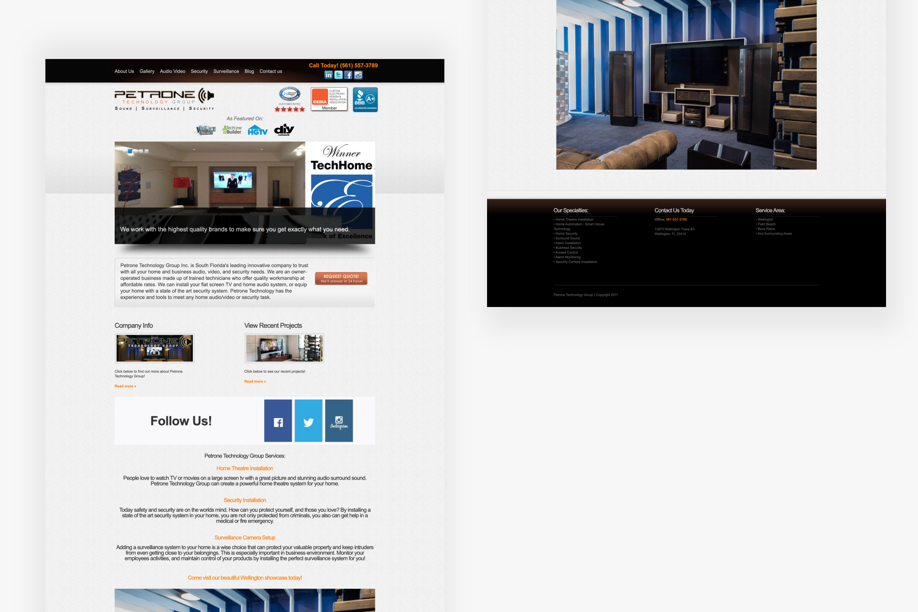
the original landing page of Petrone Technology Group
CHALLENGES
As the client was unsure on the redesign, I didn't want to introduce changes that were too drastic, while keeping as many parts of what they have on their website as possible. The challenge was to find the right balance between good design and the original version.
THE FINAL
With that in mind, my main focus was to clean up the design and organize the content in a more effective manner. I feel a selling point of the company is that they have been featured on well-known channels such as HGTV and DIY Network, so I wanted to make this section more visible to entice potential customers.
Next, I wanted to highlight the services offered by the client since that is usually what most potential customers will look for when they visit the website. This is done by having the content in bright orange and white against a dark gray background to create contrast; I also added corresponding icons to make it even easier to tell the services at first glance.
As mentioned earlier, there were some unnecessary sections on the website such as the Follow Us and Company Info Sections, which I removed in the mockup. Finally, I expanded on the section showcasing their recent projects since people are more likely to engage their services if they have a track record of past work.
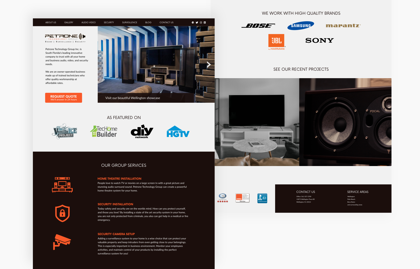
the proposed redesign for Petrone Technology Group's landing page
