Kennetik Kommunications

OVERVIEW
Kennetik Kommunications is a leadership and communication skills training provider based in Maryland, US. Their core purpose is to train corporate leaders to communicate with confidence, clarity, and credibility. Ultimately, they help people to become better speakers and storytellers.
I worked with the client to design a logo and banner for their Facebook page. They didn't have anything specific in mind for the logo, only that the logomark has to be strong and convey the nature of their business even without text.

the final logo for Kennetik Kommunications
CHALLENGES
In this case when the client was more general in what they were looking for, I would usually come up with a few initial concepts and see what they say. The challenge here was in conceptualization — coming up with something that makes good design sense, while taking the client's feedback into account.
LET'S EXPLORE
My first thought was that the name is quite unique, with a "K" instead of the usual "C" for Communication so both words start with the same letter. I decided to draw upon that aspect for the logomark, while incorporating the idea of communication into the design. One is likely to associate communication with a chat bubble in terms of visual language — which was what I went with for the two concepts.
Out of them, the client really liked #2 with the clever use of a chat bubble in negative space. We moved forward with the concept and explored some options, such as whether the "K" should look serif or sans-serif. After some discussion, we decided to have the "K" in serif and the text in sans-serif to create contrast in the overall design. It also makes the logomark more visually complex and easily identifiable as a standalone.
THE FINAL
Since the client already has their brand colors in place, it was just a matter of applying them to the final design — though we did have some differences in that regard. The client wanted the colors to be split between the logomark and text, while I felt that having a single color for both would make it more cohesive and easier to read. In the end, I sent them all 4 color options so they can choose whichever works best for them.
For the Facebook banner I kept it simple, using the same brand colors and incorporating a photo that represents what they do.
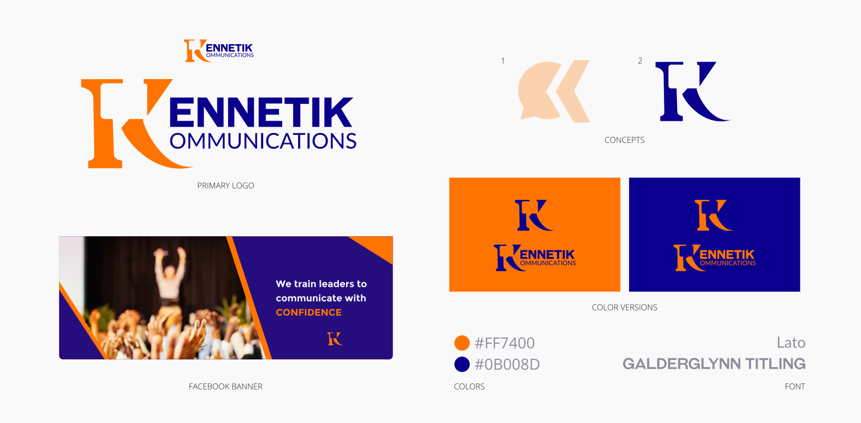
the logo design and Facebook banner for Kennetik Kommunications
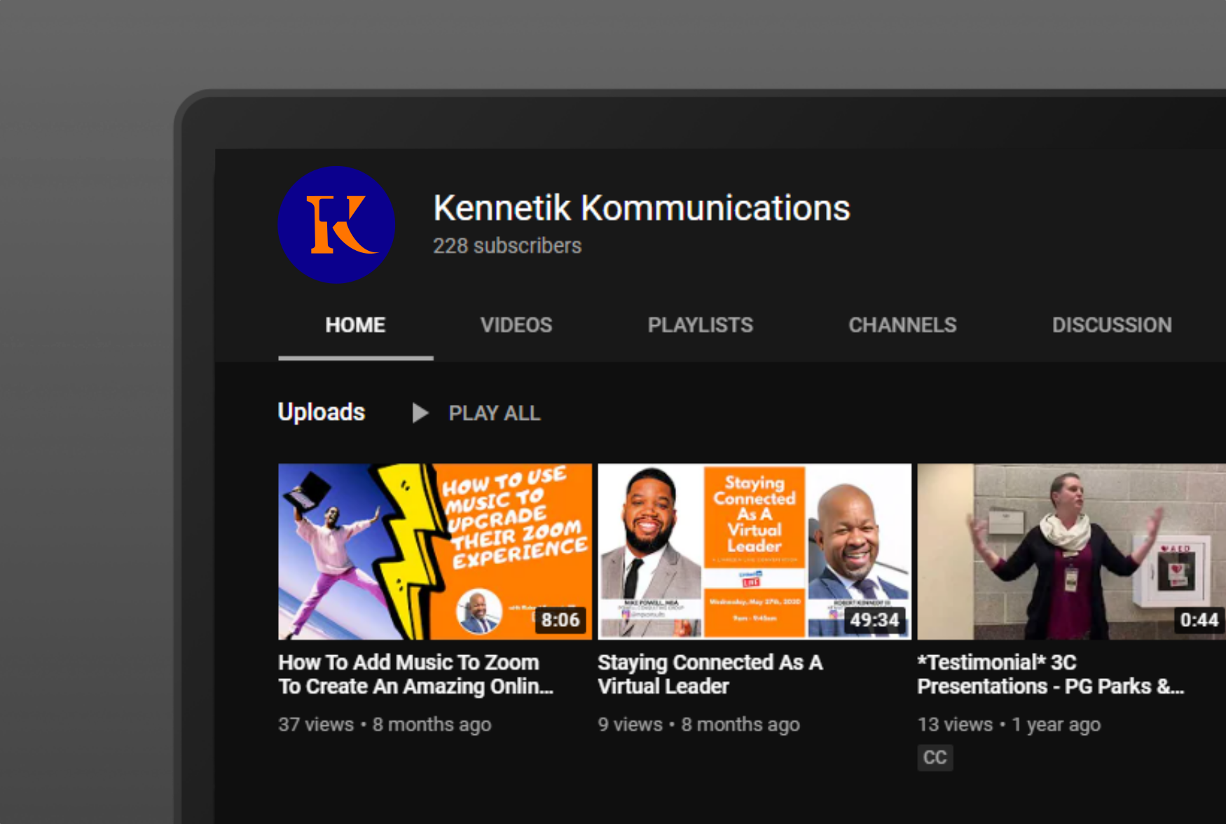
the logo as displayed on their Youtube channel
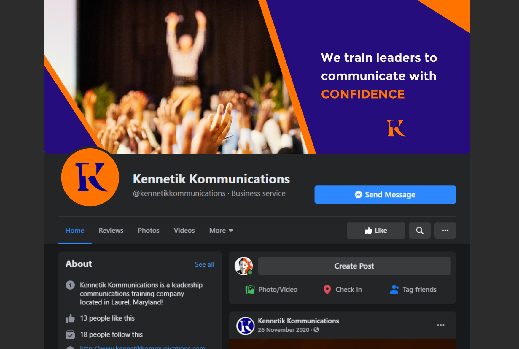
a closer look at the Facebook banner
