9s Seafood

OVERVIEW
9s Seafood is a third generation business with more than 60 years of history. From their humble beginnings as a roadside stall in Chinatown, they are now a well-established fresh and frozen seafood supplier in Singapore.
For those curious about their name, they came up with "9s" for "nice" because simply put, that is what they aim to bring to their customers. Over the years they have built up a loyal customer base, with many praising their excellent service, responsive communication, and attention to detail.
I was approached by the client to redesign the logo for their brand. The one they had was a 5-minute job in PowerPoint, but now that they're expanding they wanted something more professional that's both clean and elegant. Scalability is also one of their main considerations — the logo will need to look good in different sizes.

the final logo for 9s Seafood
WHAT WAS THE PROBLEM?
Let's take a look at the logo they had. In general, the design works both conceptually and aesthetically to a degree. It was simple enough to be readable even when sized down.
However, there were some design issues upon closer inspection. The "S" wasn't as readable and the fish not as geometric as I would've liked; the dots on each side of "where fresh begins" were also unnecessary. While insignificant by themselves, such issues do add up to create a less favorable impression with potential customers.
In short, I felt that while the logo had potential and the concept was sound, the overall design could definitely be improved upon.
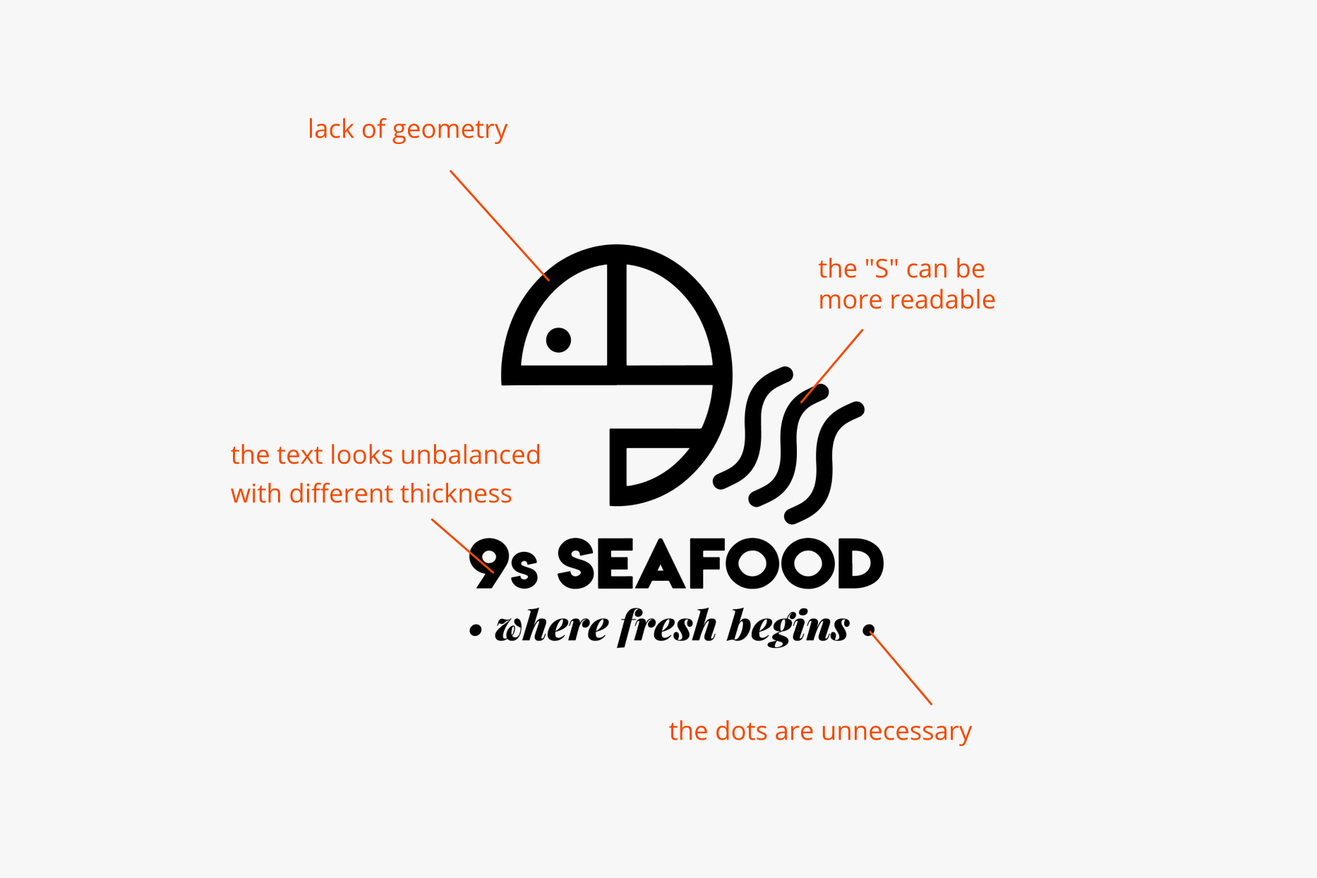
the logo they had for 9s Seafood
CHALLENGES
When we worked together on this project in 2020, 9s Seafood is already a well-known brand in Singapore, with over 20k followers on Instagram and 7k likes on Facebook.
As such, the challenge was to retain as much brand equity as possible in the redesign by sticking to the concept of incorporating seafood and the characters "S" and "9".
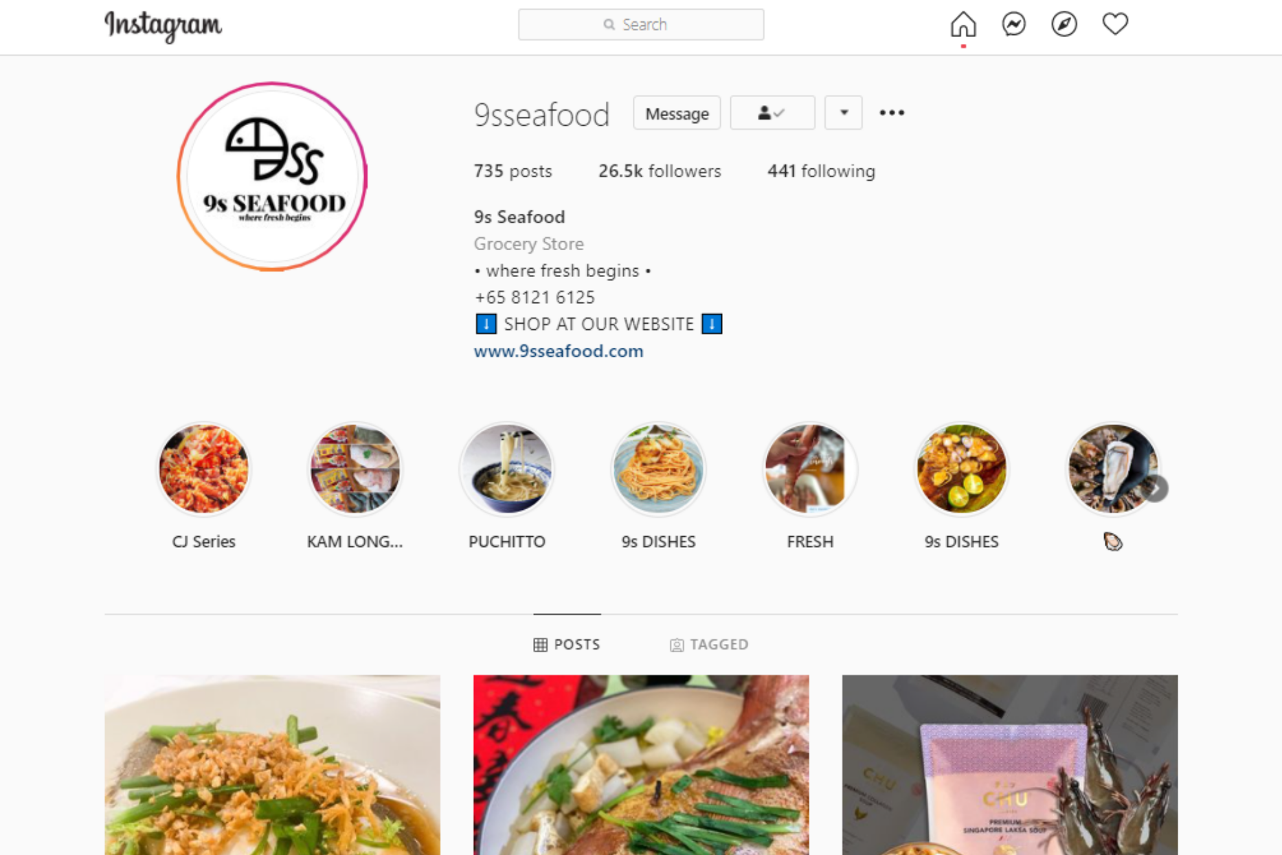
9s Seafood has more than 25k followers on Instagram as of 7 Feb 2021
LET'S EXPLORE
I came up with a number of concepts for the client, exploring the use of negative space, minimalism, and clean lines. As fish usually comes to mind when one thinks of seafood, I wanted to feature fish or fishes in all of them.
As fishes have curved shapes, I tried to make use of them to create the "S" and "9". For the bottom 3 concepts I also incorporated other types of seafood, such as prawns and clams.
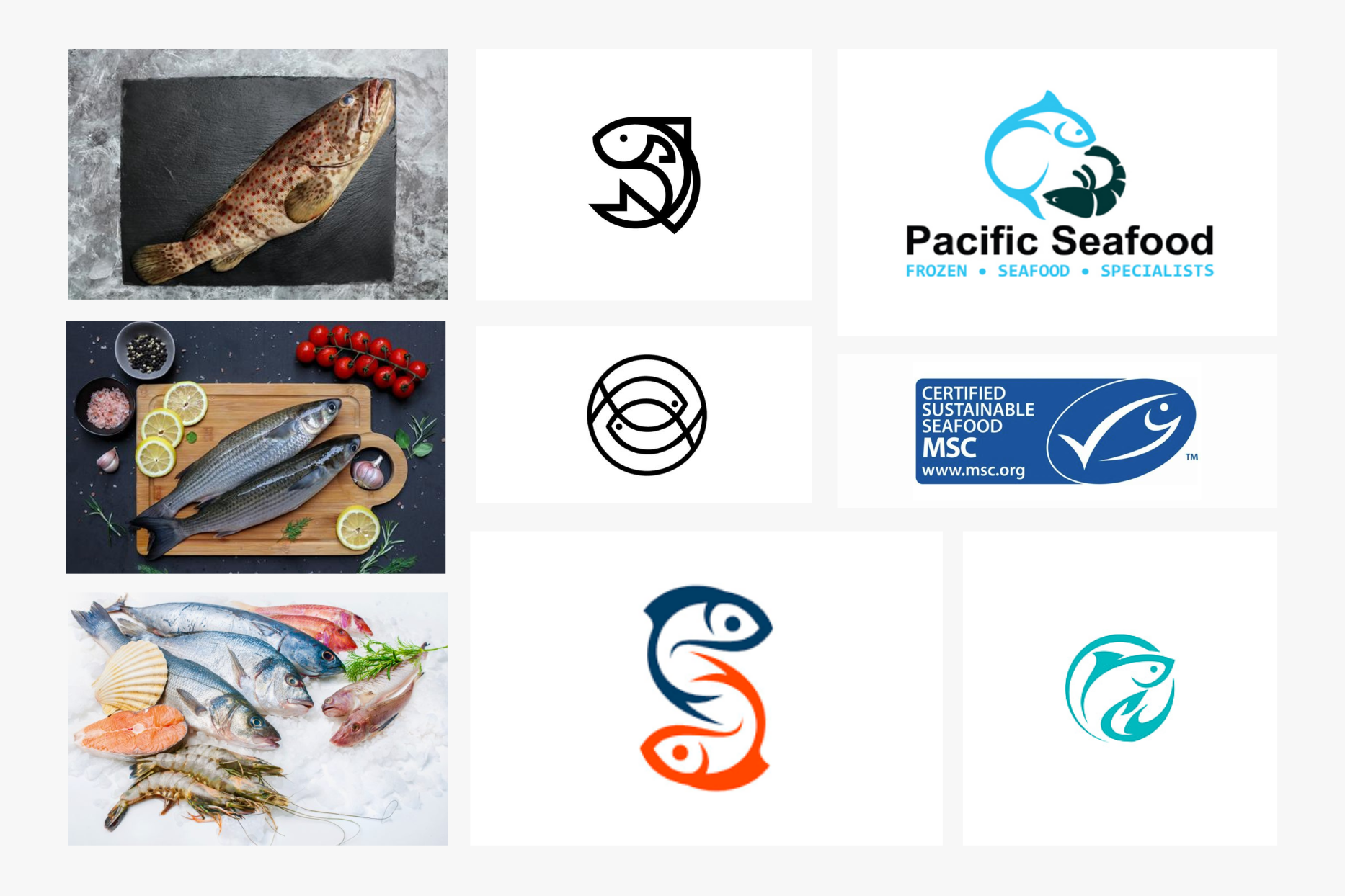
some of my inspiration for this project
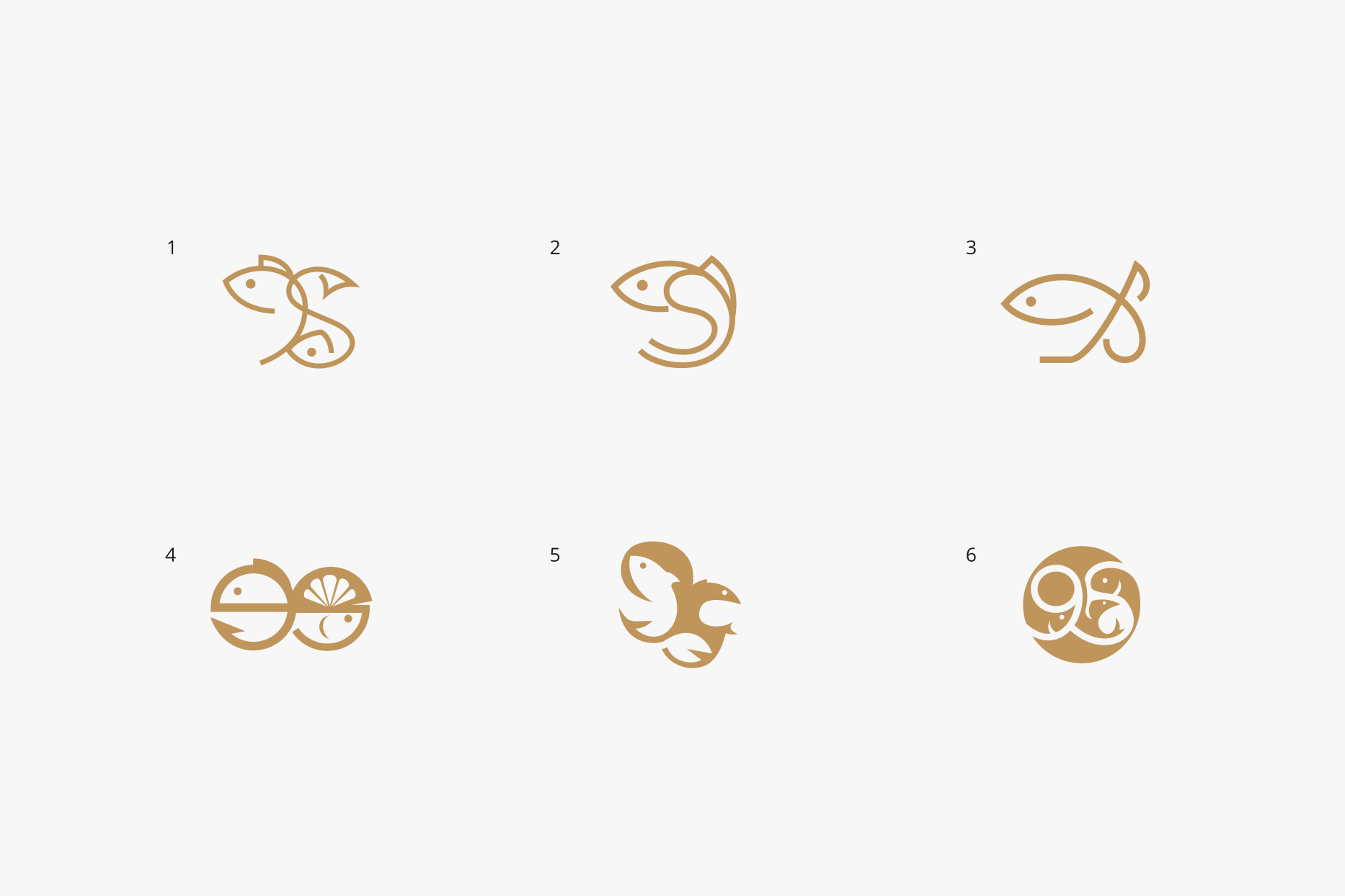
I presented the client with 6 logo concepts
CLIENT FEEDBACK
Generally, the client liked the concepts but were leaning towards #4 and #5 as they preferred something that's more minimalistic and line-centric. However, after some discussion among the company directors, they decided to stick with the logo they had; I was asked to make some improvements instead of creating something new.
In some cases I wouldn't recommend this course of action as a logo designer. However, as mentioned earlier there was potential in the logo they had so I wasn't against working and improving upon what they had.
THE FINAL
After further discussion with the client, we finalized on this version. I made the fish circular and the curves of the "S" more pronounced. We also went through a few font options for "9s Seafood" , from which the client took my suggestion of going with a serif font to accentuate the luxurious feel of their brand, as seafood products are generally considered a luxury in Singapore with its predominantly Chinese population.
Overall, the final logo looks cleaner and more professional, and the client was very satisfied with how it turned out.
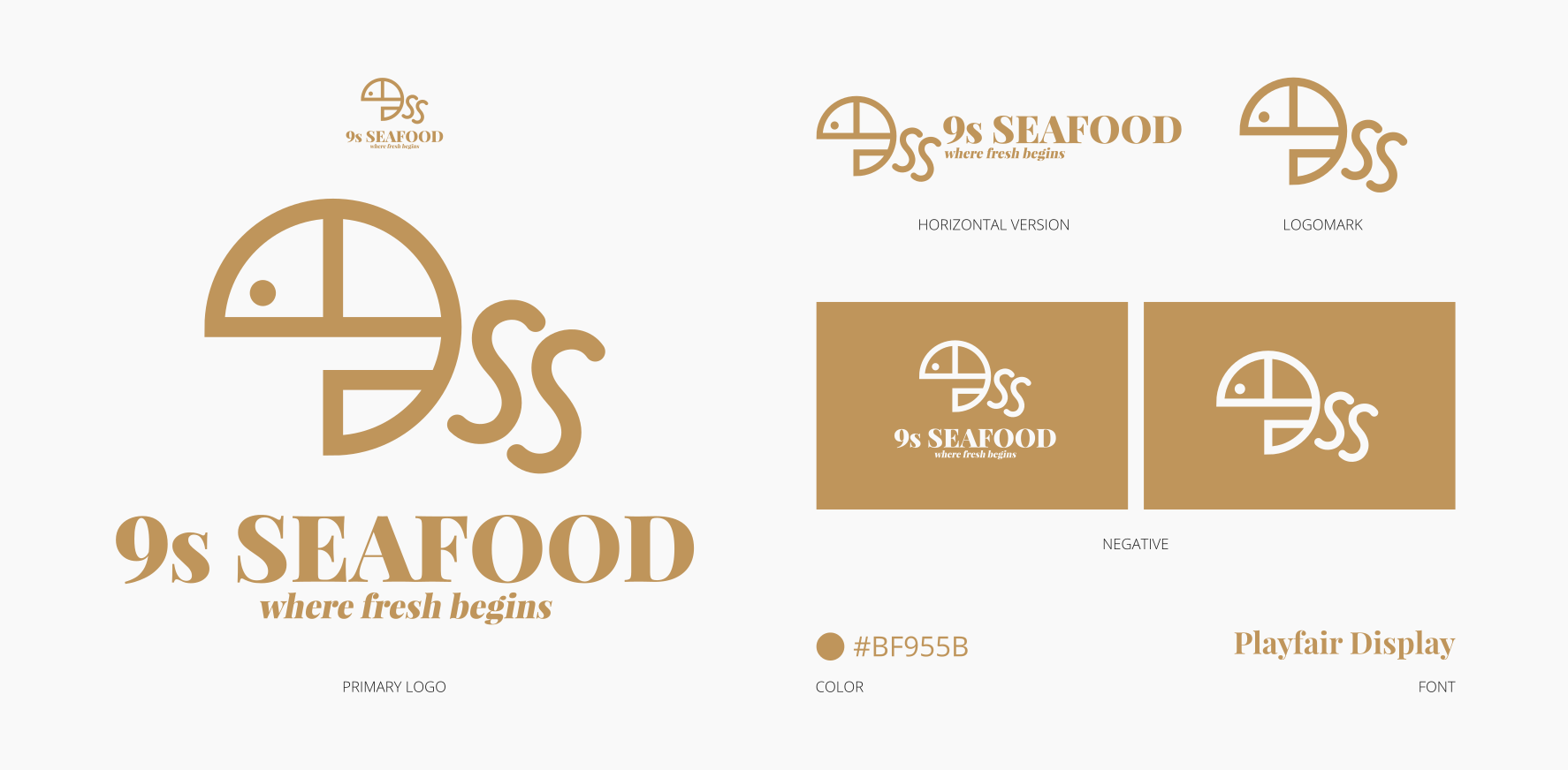
the logo redesign for 9s Seafood
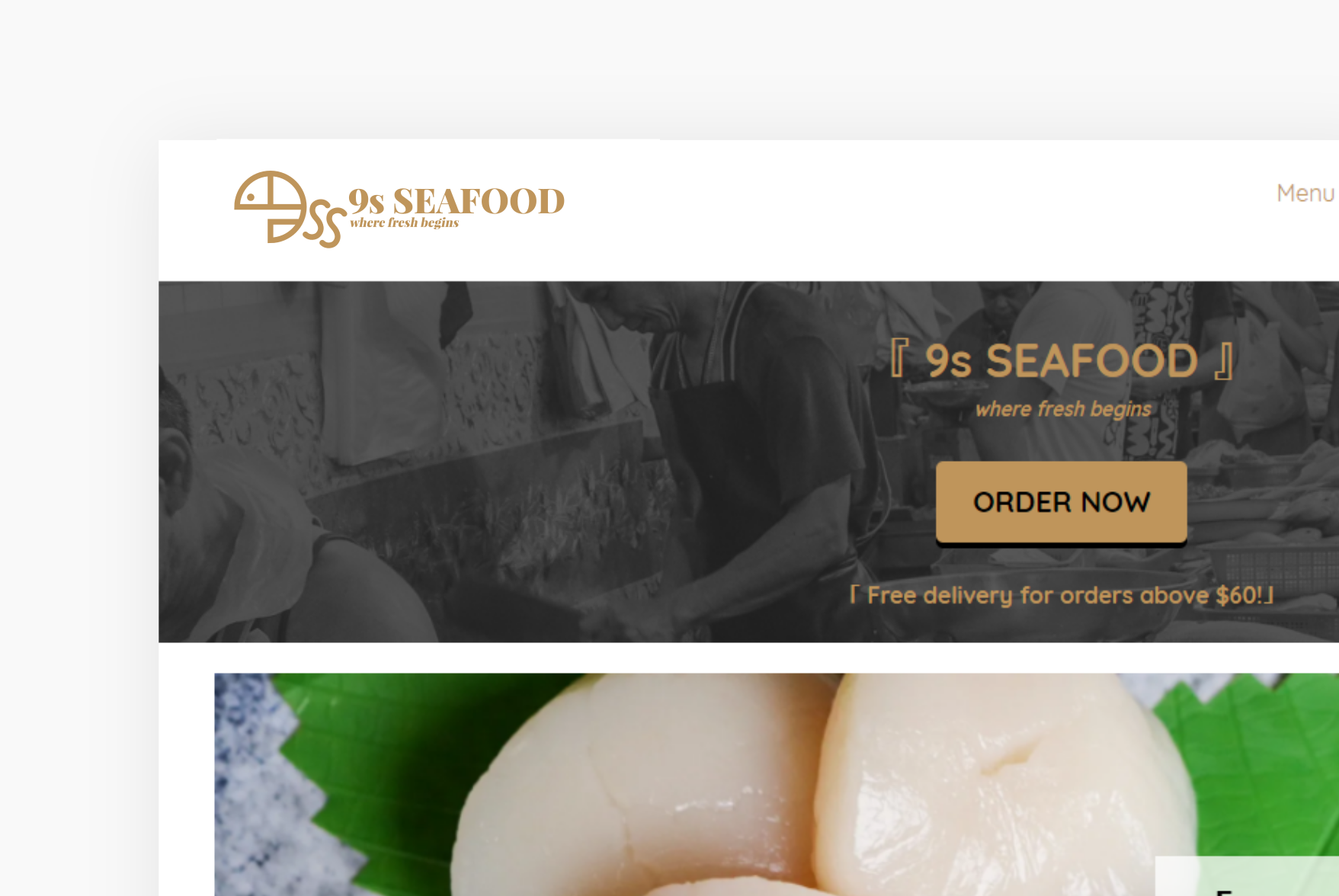
the 9s Seafood logo on their website
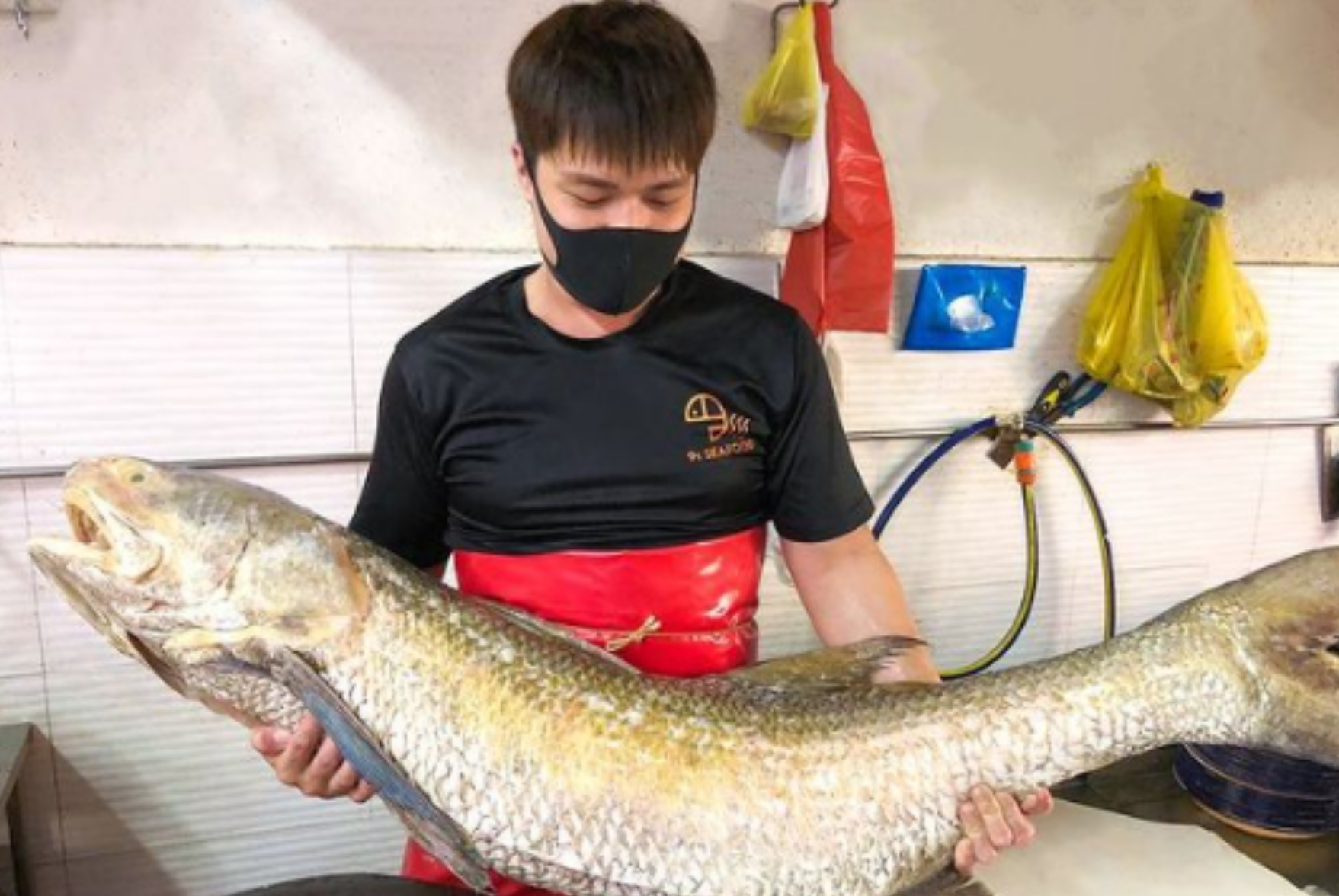
a 9s Seafood staff holding a humongous fish!
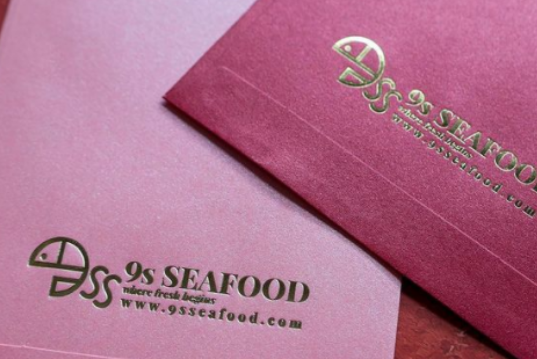
red packets with the 9s Seafood logo debossed on them
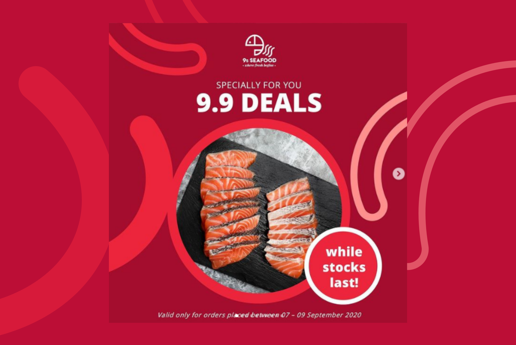
a digital ad with the 9s Seafood logo displayed on top
